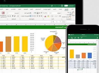
 When you have numerical data boxed in Excel tables that are difficult to read and to present to someone, you always have to draw a graph, in order to summarize the data in an image that immediately gives an overview of the situation without getting lost in reading and comparing numbers.
Creating graphs and function graphs is one of the most popular and used Excel features, so learning how to do them will allow you to create complete and professional jobs, even when we work from home.
In this guide we will show you how to draw chart or function with excel, focusing on the types of graphs most used in the world of work and on the data to be modified within the graph itself to make it unique.
Draw chart or function with Excel
There are various types of graphs that we can create in Excel, it is up to us to choose the one that best suits the type of data entered in the cells. If we don't have Excel, we can get it by reading our guide on All the ways to use and download Office for free.Prerequisites for creating a chart
To create a chart we must first of all have consistent data inserted into the Excel cells, even better if already formatted in the form of a table.We then open Excel, start inserting the data in the rows and columns, select all the committed cells and press the button at the top Format as a table.
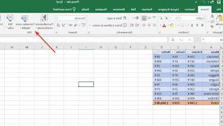
Once the table has been prepared, we can proceed with the creation of one of the graphs recommended in the rest of the guide. If we want to find out how to create elaborate tables for our data, we invite you to read our dedicated article How to make a table in Excel.
How to create a histogram chart
One of the simplest charts to create is the histogram or bar chart, very useful for comparing values between them.To make it happen, select the data or the table to be included in the graph, press the menu at the top Inserisci then we press the button Insert Histogram or bar chart.
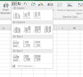
In the window that appears we will be able to choose the histogram among the graphs available in 2D or even in 3D, much more beautiful to see.If the proposed models do not convince us, we can view other graph models by pressing the button Other histograms.
How to create a pie or donut chart
Il graphic to Cake it is one of the most representative in an Excel document, having the appearance of a sliced cake of various sizes (based on the values entered). This is used when it is necessary to show how the percentage quantity of one category is much larger than the others, especially when it comes to statistical data.To create one, select the data or the table of the spreadsheet, let's go to the menu Inserisci and press on Insert pie or donut chart.
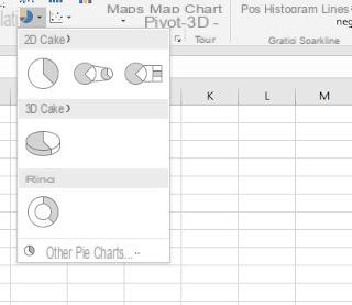
Also in this case we will be able to choose between a 2D cake or a 3D cake, in addition to the donut chart, a special type of circular pie chart with a hole in the center. If not satisfied with the proposed models, we can view others by clicking on the item Other pie charts.
How to create a line chart
Il line graph it allows you to view changes over time, to draw the trend or evolution of a certain quantity as the months or years progress. For example, it is possible to draw the trend of expenditure over the last 5 years or to compare the growth of the male population with that of women in the last 10 years.To create one, select the data or the table to insert, let's go to the menu Inserisci and press on Insert line or area chart.
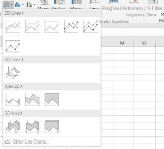
We will thus be able to create various types of line graphs; in addition to this form of graph we can a Area chart, where the area below the line is filled with color.
To view other types of similar graphs just press on the item Other line charts.
How to create a scatter chart
A particular type of chart is that a dispersion, which is used by scientists and statisticians, to plot data points and show correlations when they are not evident. For example, success rates for medical therapy can be shown in correlation with time in hospital or to show that people living in a particular area get sicker than people living in other cities.To create one we will have to select the data as seen in the previous graphs, take us to the menu Inserisci e premere sul pulsating Insert scatter chart (X, Y) or bubble chart.
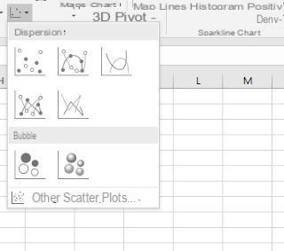
Similar to the scatter chart is the bubble chart, which allows you to have a more fun visualization when you have to plot three dimensions of data (the third dimension is indicated by the size of the bubble) and to represent two sets of data with a single graph.
Also in this case we can view other types of similar graphs by pressing on the item Other scatter plots.
How to create an advanced chart (surface, waterfall, funnel etc.)
The most complex graphs to create can be inserted by taking us to the menu Inserisci e clicking on your button Insert waterfall, funnel, stock, surface or radar chart.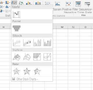
These types of graphs are difficult to create, which is why they are usually reserved only for those who have been chewing on economics and finance for many years and are already familiar with every function and calculation available in Excel.
How to complete and beautify Excel charts
As soon as we have added the chart to our spreadsheet, we will need to insert the vertical or horizontal labels, which will then be added manually to make the viewer understand what they mean. To add the title and descriptions of the graph, all we have to do is press the + button in the upper right corner and make sure it is selected Aces Titles.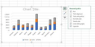
By placing the mouse on Axis Titles, a small arrow appears to the right which leads you to choose whether to include both or only one of the two axes, the horizontal or the vertical; after adding them, click on the writings Axis title e Graphic title to edit them. From the menu + You can also add data labels and, depending on the chart type, a trend line.
Within a chart it is possible change the default text formatting.
To do this we will have to select the text of a single title and double-click it to display the font editing window.
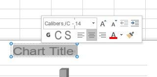
You can also change the font of the entire graphic by selecting the graphic and choosing the font from the Home menu and from the Font section; this way you can also change the size of the text. This working mode can be implemented with any element of the chart: labels, titles, data series and axes.
Nothing prevents you from inserting them as titles in the chart text written with particular editorial graphics of Word Art, much more captivating. To do this, just go to the menu Inserisci, we press the button Text and expand WordArt.
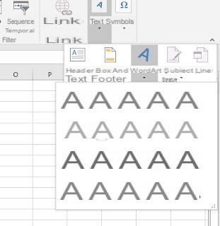
The added WordArt box can then be reduced and positioned where it should be.
Pressing on the button in the shape of a brush, visible after clicking on the graph, it is possible to try different graphic styles among those available and also try different color combinations to distinguish the various data.
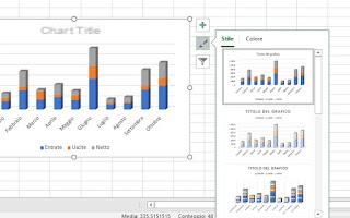
You can also choose a custom color from the fill options; selecting the columns of the histogram (just double click on one of the columns) and pressing the right button on one of them or, from the menu of the right column, we can choose to use a gradient fill and customize the appearance of each column or of each part of the graph.
We will also be able to use an image or texture fill and insert a custom background from an image file under the graph (possibly able to display the entire graph without too much effort).
Finally, we can use the funnel button it is for filters within the chart, in order to exclude some columns from the representation.
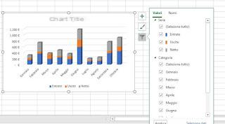
This button is really very useful when we have a lot of data in the chart and we want to customize it carefully, so as not to leave anything to chance.
Conclusions
Excel comes with a large amount of graphs to use and making a good graph is among the most requested skills when presenting a job or data collection.In addition to Excel, we can also create graphs online, without any program, as seen in our guide Sites to create pie, line and bar charts, free and online.
If, on the other hand, we need to create invoices quickly and quickly in Excel, we invite you to read our article How to create an invoice with Excel, from scratch, simple and personalized.
Do we still consider ourselves inexperienced in using Excel? We can learn all the tricks and most useful functions of the Office program by reading our in-depth study on how Getting good with Excel on spreadsheets (also with LibreOffice and Google Drive).


