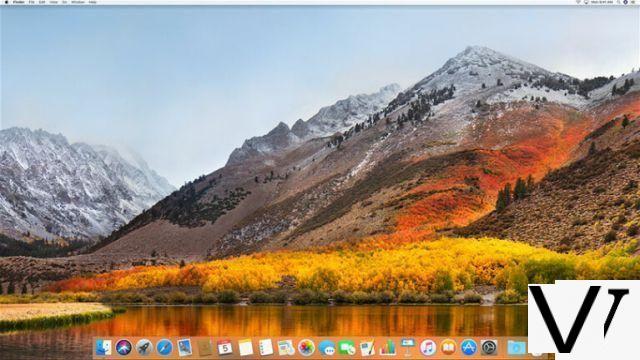
Released earlier this week, iteration 10.13 of macOS brings a lot of new features to users of Apple machines. And if most are completely invisible to ordinary people, others are presented in a slightly more concrete way. This is a good opportunity to come back to all this with, as a bonus, some good tips for newcomers.
We already talked about it recently in the news but a booster shot never hurts. Should High Sierra be installed? The answer is in fact variable geometry. First, you need to know if your system is compatible, which will be the case if your Mac dates from 2009 (or 2010 depending on the case) and after. In absolute terms, if you were able to upgrade to Sierra (10.12), it is certain that you can install the new version of the system. But beyond the possibility of doing so, it remains to determine the interest. To know your version of macOS, it's very simple, just click on the top right on the apple icon then on "about".
Because the main change brought by High Sierra is hidden in the guts of the product. This is actually the file system. Apple has indeed decided to abandon its old HFS + to switch to APFS (which iOS users in fact already use without knowing it and already present but optional in macOS Sierra). Concretely, the idea is to have a more efficient, faster and better secure system. Important note: this new file system actually and for the moment only concerns flash storage units (SSDs, USB keys, etc.). Possible compatibilities with mechanical hard disks and Fusion Drives are not for now. Apple has detailed all of this on a dedicated page.
Another intrinsic novelty: Metal 2. Here we are more on a graphics technology allowing developers to produce content more in tune with their time, such as augmented or virtual reality, while Macs are still lagging behind on this point. We are not going to dwell on this and go directly to video compression with the deployment of the H.265 (or HEVC) format. Here again, we find a logic of modernity and performance with a video format more in tune with the times.
With all this, we still haven't answered the question of whether or not to install High Sierra. We would be tempted to say a big yes, because even without taking advantage of the new file system, macOS 2017 brings a lot of nice little things that we are going to go into in detail, for example the Photos application. Okay, let's be clear: if you have an APFS non-compatible Mac and you don't care about the photo, you can stay on Sierra, your usage won't change. But in our experience, the usage performance is still roughly the same, so you probably won't lose much by updating. On the other hand, if you're really not interested, it's worth noting that Sierra, El Capitan, and Yosemite are still part of Apple's support. In short, it's up to you! And as always with system updates, consider backing up all your data, for example with Time Machine.
Beautiful Photos
It is clearly here that the novelties brought by High Sierra are most visible. Previously intended for viewing and some basic editing, the Photos application has many new features. To see them, just launch the software and take a random photo. Then, all you have to do is click on "Edit" to switch to the retouching section, or "Development" for those used to Lightroom. These will also find the classic black interface which makes the photos stand out.
There are many tools that can be used to modify brightness, white balance, levels, curves, sharpness as well as noise reduction. Frankly, Photos becomes thanks to this the perfect software for small everyday adjustments thanks to its incomparable ease of use. You shouldn't expect a level of power comparable to Lightroom, the two software clearly do not box in the same category. However, we can see from the captures that it was very easy to remove a swan from the image using the "Retouch" function. As before, many filters are available to enhance the photos.
Ranking and ergonomics level, Photos has also been redesigned. We see it with the new irremovable left sidebar (it was optional before) and the various tabs such as "Memories" which allows you to view the photos in dated groups. In general, changes are going in the right direction, especially for those who want a simple tool to improve the rendering of their images. Another big novelty, the possibility of opening a photo in different compatible software (Pixelmator, GIMP, Lightroom…) with a simple right click (or double-tap on the trackpad) on the image that you want to externalize.
Finally, a new classification menu has appeared at the top right in order to sort images more efficiently. We can then display them in different ways, favorites, modified or by keywords. In the same idea, it is possible to display only photos or videos. IPhone users will also find options specific to Live Photos.
More ferocious safari
The statistics are not mistaken: virtually everyone uses Google Chrome. We will of course not judge this choice, but it is not uninteresting to take a closer look at Safari. Firstly because it is an excellent browser and secondly because Apple has given it some very interesting new features. These new features are not specific to High Sierra, but also concern the latest version of Safari for Sierra. In concrete terms, this mainly involves preventing the automatic launches of videos with a soundtrack and implementing intelligent protection against tracking. In short: avoid these annoying ads that follow a user everywhere on the web by analyzing cookies using machine learning. A novelty which - one suspects it - will not necessarily please Internet advertising professionals.
Better note taking
Indispensable, the Notes application has been enriched with two big new features, namely the ability to pin notes (right button, pin) and the ability to include tables in the content. Nothing crazy, but quite practical additions. Probably not enough for the most avid Google Keep users.
To learn more
We talk as if everyone has lived their entire life with macOS, but we must not forget the newcomers. Those who are buying a Mac for the first time and are sometimes a little confused. For them, and just for them, here are some good tips to avoid curling up in a corner after four hours spent trying to understand ergonomics like High Sierra or another version of macOS. It is sometimes hard to admit it, but when you switch from one operating system to another, the new platform does not necessarily seem "logical". The old one has accustomed us to an ergonomic paradigm of its own. Mac newbies often have a hard time getting used to the behavior of the top bar that shows the options for the active application and a whole lot of other things. Don't panic, there is actually nothing too complicated.
The magic of the Dock
Remember that on a Mac the quick application management interface is the dock. You can arrange it as you want, remove applications that you consider unnecessary or add others. Just right-click (or two-finger tap the trackpad) to open the context menu and see add or remove options. Many find the basic dock too big by default. Fortunately, it is quite possible to change it by going to the settings (the gear icon… in the dock). Logically, we will favor a dock that is not too provided in order to see more clearly. Small tip: the small black dot below an application indicates that it is an active program. If there is nothing below, the application is currently not open.
Tags using the Finder
Apple's equivalent of Windows Explorer, the Finder does not necessarily look good with its outdated interface that we would like to see fundamentally change one of these days. However, the tool can be very practical, in particular thanks to the excellent system of tags (or labels) integrated by the developers of Apple. You can find all of this in the left side column, at the very bottom. Thanks to tags, which can be renamed other than by color names ("important", "work", "course", etc.), it becomes very easy to find files in the same category. The usefulness of tags is not necessarily obvious at first glance, but once you have tasted them, it is very difficult to go back.
Space thanks to virtual offices
Many Mac users go months or even years without even realizing that you can use multiple workspaces. To activate virtual desktops, just click on the Mission Control icon in the Dock (or press F3). Then, in the top bar of the screen, on the far right, click on the little "+" to add a new workspace. To send an application to another desktop, just drag and drop it to the thumbnail of another desktop.
Screenshots easily
On a Mac, screenshots are as easy to take as they are impossible to come by. To take a full desktop capture, you "just" need to do shift + cmd + 3. For an area of the image that you draw yourself: shift + cmd + 4. And for a full window, shift + cmd + 4 and then space bar (the zone cursor becomes camera) before clicking on the window in question. When explained like this, the techniques seem a bit painful, but it's actually very practical on a daily basis! To find the images thus generated, it is quite simple since they are automatically found on the desktop, in .PNG format. Unfortunately, it is not possible to change the destination directory or the output format without going to the command line hack.
Direct access to emojis
It's 2017, no one writes to their friends without adding a nice little family emoji. To easily send a heart to the person we dream of or a banknote to the one who owes us money, it suffices (with the cursor positioned in the input interface) to do ctrl + cmd + space bar and the emoji window appears as if by magic. No luck, you can't add several emojis at the same time and you will have to repeat the maneuver for each iteration.
Images at a glance
If the Photos application has been enriched with new cool options, it is not necessarily the ideal image viewer when it comes to going fast to look at a single image or a series of photos. For this, there is the little-known "glance" function. It is found by clicking on the file options, with the traditional right button (or its equivalent trackpad) or, more simply, by pressing the space bar. The app launches very quickly and it is possible to select several images to launch them all together in "glance". To navigate in the selected photos, just use the arrows on the keyboard.
Conclusion
All new, all beautiful, all warm, High Sierra remains transparent enough for the user who is not interested in intrinsic novelties. With the deployment of APFS, H.265, Metal 2 and all the new features visible in particular in the Photos application, we can however say that macOS 10.13 is now well anchored in its time. A well thought-out, practical and often very ergonomic system, even if you sometimes have to know it a little to appreciate all its qualities.


